
WRITING / MARKETING
Your website should answer the question that brought me there.
A visitor arrives with a problem. Your company history can wait until they understand whether you can help.

Someone sends me a website because they want my opinion.
I can look at the colours, the spacing, the photography and the typography. I care about all of those things.
But the first thing I want to understand is very simple: what is a person supposed to do here?
Buy something? Decide whether the business can help? Apply for a conversation? Find an answer before making a decision?
A website can be beautifully designed and still make that unnecessarily difficult.
Start where the visitor starts
Imagine you run a restaurant and want help bringing people in on quiet weekdays.
You click through to an agency. The opening line tells you they are passionate about delivering innovative solutions. Underneath is a video, then a list of disciplines, then a paragraph about their vision.
You still do not know whether they understand your problem.
Now imagine the same page explains that they help restaurants improve demand on quieter days, shows a relevant example, describes what they would need to investigate and gives you a clear way to start.
You can make a decision.
The design matters in both versions. In the second, it has something useful to organise.
I have been building websites since I was a teenager. My first serious one was for Tropicana Hotels and Resorts. There was plenty to learn about making the pages work, but the business behind them still needed people to understand the properties and send a booking request.
The technology changes. That responsibility remains.
GIVE THE VISITOR ENOUGH CLARITY TO TAKE THE NEXT STEP WITH CONFIDENCE.
A button cannot finish an unfinished argument
Adding “Book now” everywhere does not automatically make a page persuasive.
Before I click, I may need to know who the offer is for, what I receive, what it costs or how the price is decided, and what happens afterwards.
For a simple download, that can be brief. For a significant business decision, I will probably need more explanation and more evidence.
The next step also has to match the promise. If a button offers a free conversation, the following page should help me apply for that conversation. It should not suddenly ask me to choose between several paid packages.
That is a small detail to the person managing separate pages. To the visitor, it is the experience.
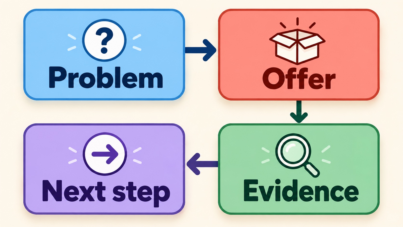
Read it as someone who does not know you
Choose one page and arrive with a specific reason.
Read the headline. Can you tell whether you are in the right place? Keep going. Is there enough substance to believe the promise? Click the main button. Does the next page continue the same conversation?
Do this on your phone as well. A form that feels manageable at a desk can feel exhausting when every field fills the screen.
Then remove the explanations that only make sense because you already know the business. Replace vague claims with something a visitor can evaluate. Keep the next step visible and describe what it involves.
Your website does not need to tell everyone everything at once. It needs to help the right person move forward.
What question brought your ideal customer to your website.. and how far do they have to scroll before you answer it?
NADER UNFILTERED
If this argued with something you believed, good. One email like it whenever there is something worth sending.. never on a schedule.
 Nader alMaleh
Twenty years. Six countries. 400+ businesses.
Nader alMaleh
Twenty years. Six countries. 400+ businesses.